

We’ve all experienced — and inflicted — the condition known as Death by PowerPoint.
But there is a cure: Mix neuroscience with design with education theory and practice.
Jared Horvath’s academic passion is translating the knowledge of neuroscience to enhance classroom teaching and learning. He has taught in US schools and is a researcher at Melbourne Graduate School of Education.
He’ s now researching the impact of digital technology on learning, looking at effective combinations of text, audio and visuals.
“Unfortunately we don’t truly learn things by just pouring data in any fashion into our heads,’’ Mr Horvath says. “Education research suggests learning only occurs if there is interaction, integration and reinforcement via different sensory channels.”
We intuitively know we need to see it, hear it, feel it, do it, think it and share it to learn it.
Mr Horvath has combed education, neuroscience and design literature to compile strategies to help people improve the PowerPoint presentation.
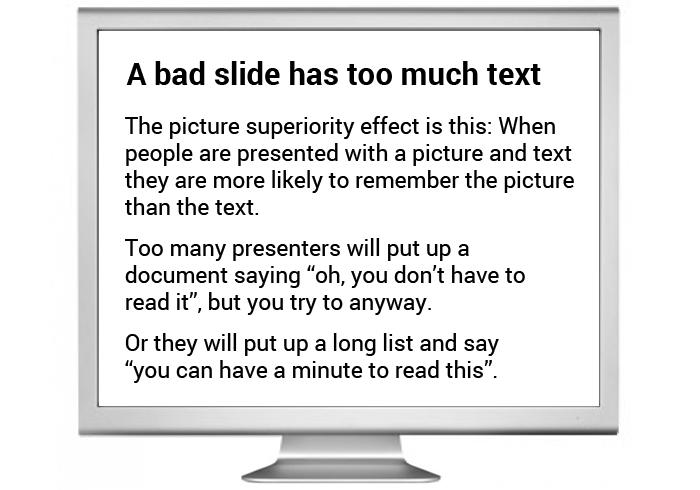
Fact 1: Neuroscience shows people can’t actually read and listen at the same time.
Listening and reading activates similar areas of the brain and the voices compete.
“A pivotal study using functional MRI brain scans showed the activation of the linguistic areas of brain for both listening and reading,’’ Mr Horvath says.
“When you read you’re actually listening to your inner reading voice. So when you’re listening to the speaker and trying to read a lengthy text, it’s often not in sync. It’s like two people talking at the same time.”

Even though you may think you can read and listen at the same time, what’s actually happening is you are flipping quickly between one and the other. The two narrative voices are competing; it’s disjointed white noise and it’s soporific.
“It’s called the redundancy principle and it’s unnecessarily mentally taxing,” Mr Horvath says.
Tip 1: Keep text on slides to essentials. Make sure what people see, hear and read are
in sync.
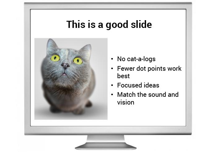
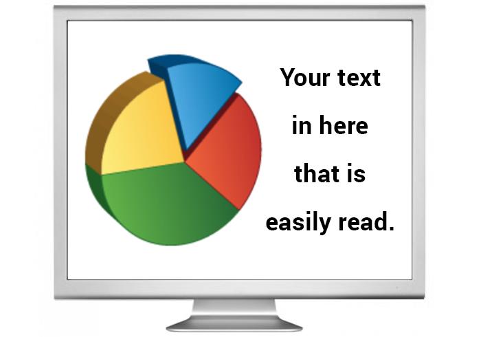
Fact 2: Neuroscience shows that images are more digestible and memorable.
A picture tells 1000 words, but verbal reinforcement of pictures is more memorable.
“Several studies have tested the impact of speech, images, and speech + images in active classrooms.
“What they consistently find is that when information is presented orally with relevant images, student learning and memory is better than when the same information is presented only orally, or only in pictures.
“It’s not just recall that’s important, but recognition. Images make concepts instantaneously digestible. For example the word ‘cat’ is interpreted in many different ways in people’s minds. Provide a picture and the audience is literally on the same page. It provides the context and the detail. Again it’s less mentally taxing.”
Images should be relevant and easy to decipher and interpret and not be covered with words.
Tip 2: People will get the picture with pictures. If it’s accessible, it’s memorable and shareable.

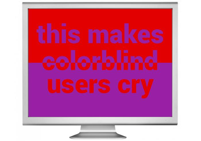
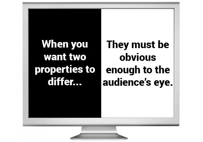
Fact 3: Neuroscience shows colours matter.
Colour blindness is a common condition. Around 1 in 12 males and 1 in 200 females see the world slightly differently.
“There is a spectrum of colour blindness that carries the level of red or blue or green perception. Whilst we may not know our colleagues’ specific types of visual capabilities, it’s best to keep high contrast. There are many websites that can help decide what works best on screen and on paper,” Mr Horvath says.
“Although colour can be used to evoke moods, white backgrounds are often a safe bet.”
Tip 3: Create contrasts that cater for colour blindness. The audience needs easy focus, not fog.
Fact 4: Neuroscience suggests, as do real estate agents, that ‘position’ matters.
“There are many studies that have tracked where our eye travels on paper pages and on the screen. But the key is choosing a layout and keeping it consistent on your slides.
“The audience then knows immediately where to focus on texts and images. Psychologists call it contextual cueing.
“I have a theory that people don’t often read headings on PowerPoints because it’s often where the logos are and people stop looking there and they go straight to the body.”
Tip 4: Keep the slide layout simple and consistent. Make sure you can read slides from the back of the room.

Fact 5: Neuroscience suggests our attention spans are varied but our brains love a good story.
Comedians have always known holding the audience’s attention and great delivery is all about … timing.
An adult’s attention span is difficult to measure as it varies enormously, according to health, age, fatigue, interest and distractions.
“Whilst sound and vision in presentations need to be in sync, you also need to be aware of pace and timing,” Mr Horvath says.
“Some talks can become hypnotic and soporific so you need to regularly break the repetitive monotony of a slide talk. You need to press the ‘reset’ button on the talk topic for your audience every 10 minutes.”
So how long should a presentation be? The answer is shorter than the time allocated to you. Mr Horvath also suggests breaking things up with a good video, an activity, some
Q & A or a story.
“A good video or a story works because our brains love narratives, we are constantly trying to find cause and effect relationship and weave information into a coherent tale with a beginning, middle and end.
“Stories are the oldest form of communication amongst humans and they engage more areas of the brain than lists, facts or dry arguments. This extra brain arousal translates to greater interest, engagement and empathy.”
Tip 5: Break the monotony to prevent PowerPoint lobotomy. Make a story your
ad break.

Some bonus information (1)
“There is no right answer to how many slides you should use; some of the best presentations have used very few slides, whilst others have hundreds (although, their slides are usually word free and visually support the oral content).
“A good rule of thumb is if you have more slides than you have minutes for your presentation, then cut down the number by half, asking ‘do all these slides serve the audience, or are they memory markers for me?’ ”
Some bonus information (2)
Should the room be dark or light? And what time of the day is better for your presentation?
Mr Horvath says the evidence for lighting levels swings both ways.
“But if your presentation is engaging and interactive, the lighting is likely to be unimportant. However, if the presentation is largely oral with little engagement or activity, then a bright room is more likely to stave off fatigue,” he says.
“Alertness levels can also be about the individual’s level of sleep deprivation and health. Afternoon drowsiness or the 3pm slump is a universal phenomena. It’s due to a dip in blood sugar levels as insulin does its work, but it’s also due to a small drop in temperature, which is part of our normal circadian rhythm.
“We don’t always have a say in our presentation schedule, but mornings or evenings are better. If you have to give a presentation at 3pm, the best way to combat afternoon drowsiness is interactive activities.”
This article was first published on Pursuit. Read the original article.